
Denmark has a strong tradition for design solutions for the urban space, and design has been a key instrument in the development of the welfare society. However, we rarely reflect on the profound role of design in shaping the urban space – and for good reason: the principal task of public design in the urban space is to provide an optimal background that facilitates everyday life, from recreation and socializing to wayfinding and transportation. Thoroughness, recognizability, approachability and, not least, coherent visual identity are key qualities of successful urban design.
Knud V. Engelhardt
Knud Valdemar Engelhardt (1882-1931) was a Danish architect, designer and printer. He was one of the first Danish architects to work with functionalism in an industrial context. Form and function were Engelhardt’s benchmarks, and he was a pioneer in rational, objective and aesthetic design at eye level with the user. He worked in all scales and designed e.g. Milestones, trams, utility graphics, type design and alphabets, signs, public city fixtures, buildings, textiles and much more. Although he is relatively unknown to many, he has had a decisive impact on Danish design and continues to inspire designers (also internationally) to this day.
One of the prominent pioneers of the use of design as a key tool in creating functional and distinctive solutions for the urban space in Denmark was architect, designer and printer Knud V. Engelhardt, who excelled in the area of public design.
As early as 1907, he designed a comprehensive proposal for a new wayfinding system based on kilometre stones to replace the existing milestones. The simple, clear and consistent communicative typographic style of this proposal marked a departure from the prevailing skønvirke style (the Danish interpretation of art nouveau), which had a heavier decorative expression. This was the first of many rational public designs by Engelhardt that left a lasting legacy.
Today, Engelhardt’s advertising columns and signage programme for Gentofte Municipality from 1923 is regarded as a Danish state-of-the-art example of successful public design. Now, Engelhardt’s pivotal role is celebrated with Designmuseum Danmark’s outdoor exhibition URBAN HEARTBEATS. This anniversary display is part of Matthias Horneman-Thielcke’s research into the Danish type design tradition.
COMMITMENT TO QUALITY URBAN DESIGN
Knud V. Engelhardt believed that the state and municipalities had an obligation to promote quality design, and he considered it an honour to work for the public sector. From an early stage in his career, he created a range of design solutions for the urban space, including the Copenhagen trams (1908–10), signage for the Baltic Exhibition (1914), signage in central Copenhagen (from 1915) and road signs commissioned by the Kgl. Dansk Automobilklub (Royal Danish Automobile Club) (1916) as well as the aforementioned kilometre stones. He also created graphic designs, alphabets, textiles, industrial objects and much more (Frederiksen, 1965). In a competition in 1913, his design of advertising columns for the City of Copenhagen came fourth, while the first prize went to Alfred Brandt’s skønvirke design, which remains in use in Copenhagen to this day .
Engelhardt was insistent and proactive in promoting the functionalist, practical and aesthetic ideology captured in his motto: ‘As long as it’s useful! Beauty comes for free, it is effortless!’ (Frederiksen, 1965). In 1919, he initiated his first recorded collaboration with Gentofte Municipality, designing the municipality’s stationery. One of the graphic elements in this design was the bell emblem – based on Gentofte Municipality’s original coat of arms – which he later included in his design of the advertising columns .
URBAN MUSHROOMS – ENGELHARDT’S ADVERTISING COLUMN
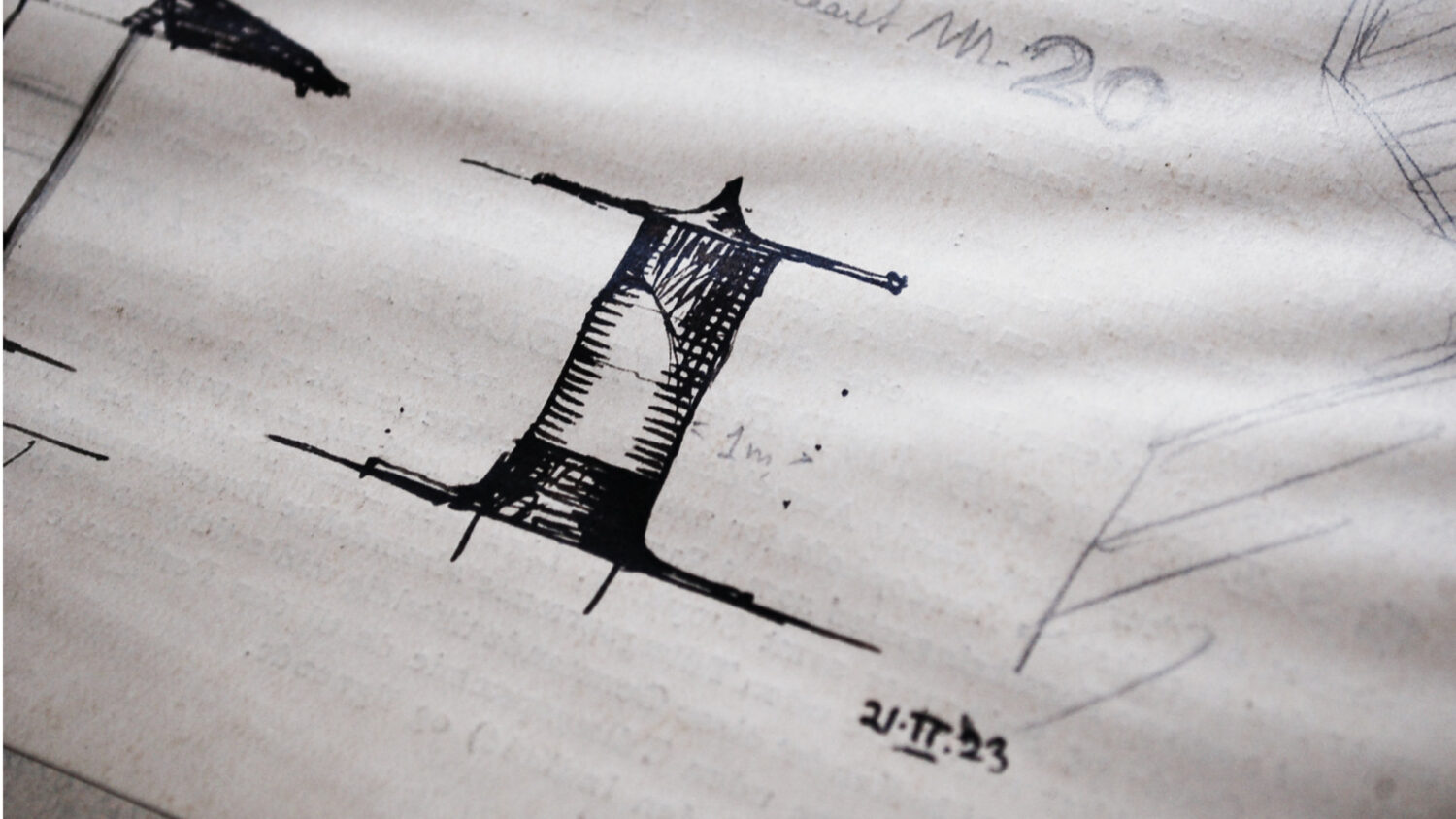
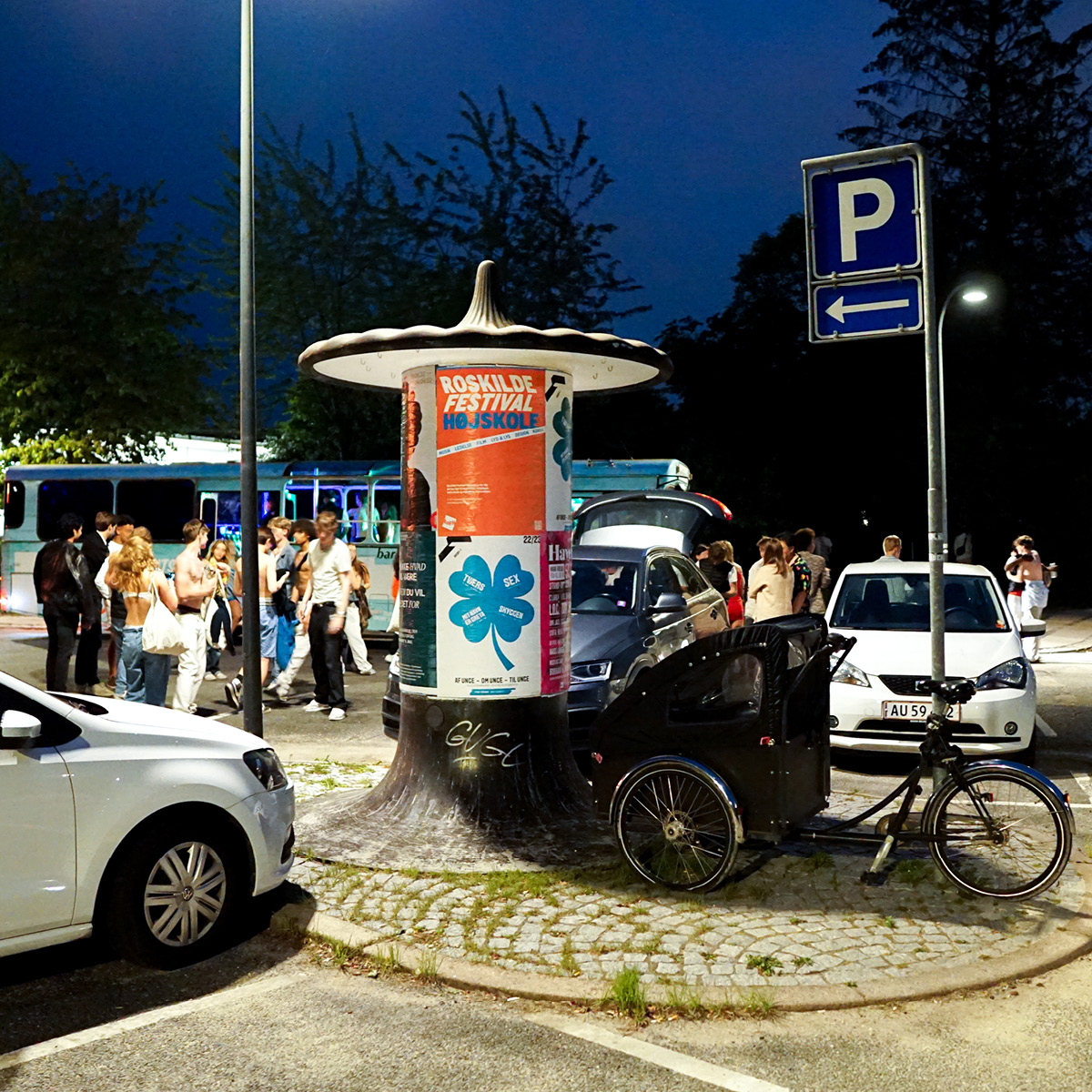
Later in 1919, Engelhardt won a competition on the design of advertising columns for Gentofte Municipality. Engelhardt submitted 16 proposals, all variations on the same basic structure with different tops (Frederiksen, 1965). The construction was made entirely in reinforced concrete, a new material that Danish architects had begun to use (Millech, 1954), with significant inspiration from the leading avant-garde architects of the time, including Auguste Perret (1874–1954) and Peter Behrens (1868–1940) . This material afforded new design possibilities, which Engelhardt utilized in his design of a functional but organic column form. The final version was ready in 1923 and consisted of three separate components: a base, a cylinder and the cap, which was soon dubbed the ‘mushroom’. His design reflected his excellent functional and practical skills; for example, the measurements of the column itself were adapted to the size of the haulier’s truck, so they would be easy to transport from the factory to their urban site.
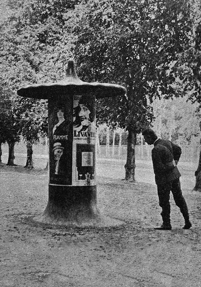
Everything had a functional purpose. The characteristic cap that topped the column was designed to shield the posters from rain and provide shelter for passers-by. The underside of the cap was fitted with tiny hooks for hanging coloured lights on festive occasions. Finally, the concave shape of the base had the dual purpose of preventing dogs from lifting a leg and urinating on the column and preventing people from leaning their bicycles against it. Last but not least, it helped keep the column clean as dirt naturally washed off. Similarly, the black coal tar paint was carefully chosen, as dust and dirt from the street would be near invisible (Frederiksen, 1965).
During the 1920s, advertising columns were an essential communication platform, promoting plays and stage shows as well as commercial products. The columns were designed with real-life use in mind. With his consistently humanistic approach, Engelhardt designed the height of the columns to display the posters at eye level with the people strolling through area with low buildings. In this regard, they differ from Alfred Brandt’s advertising columns for Copenhagen from 1913, which were taller and far more monumental, designed for an area with multi-storey buildings and a more hectic urban scene.
To this day, Engelhardt’s advertising columns appear as functional beacons on city street corners, displaying current posters. Now as then, their communicative qualities are enhanced by the characteristic (mushroom) shape, which enriches the urban space with a strong element of recognizability and visual coherence.
AVANT-GARDE ALPHABET SHOWS THE WAY
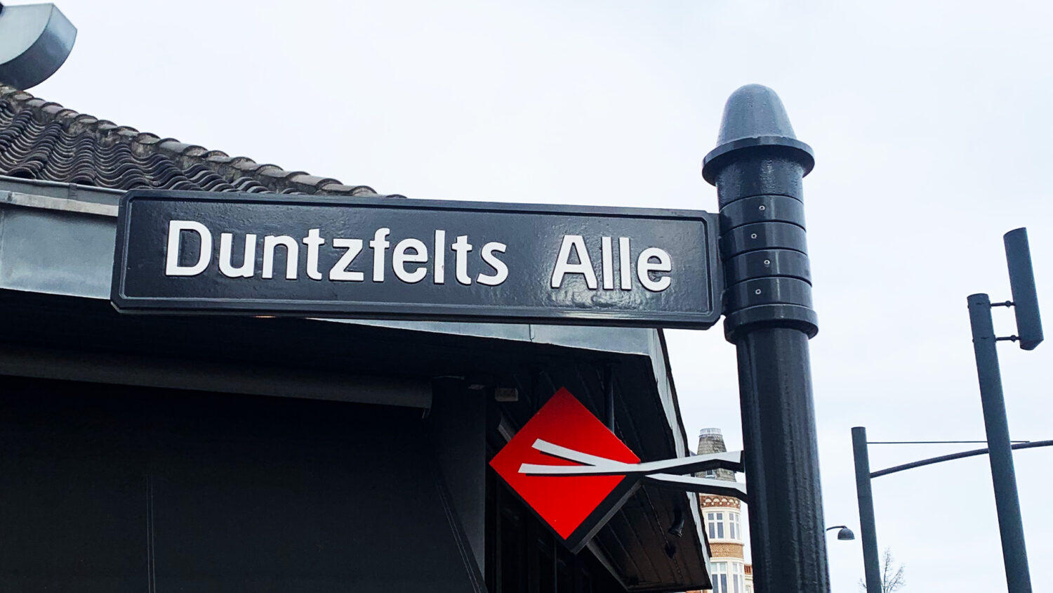
Another of Engelhardt’s landmark designs for Gentofte Municipality featured in the URBAN HEARTBEATS exhibition is his street signs. First commenced in 1923, they were later supplemented by house numbers. The signs have formed a distinct visual trail throughout the city since their implementation in 1927, but their impact extends beyond the town and municipality. With a true visionary touch, Engelhardt created a new modular typeface for the street signs based on a specially designed alphabet.
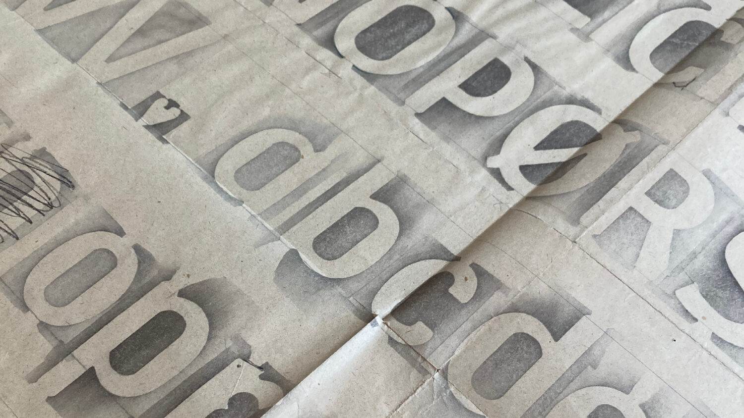
Engelhardt’s type design was ahead of its time, especially with regard to rationality, standardization, aesthetics and legibility. From an early time, Engelhardt shook off the influence from skønvirke and, in particular, the legacy of architect Thorvald Bindesbøll and aimed instead for a more functionalist and modernist expression, as exemplified by his kilometre stone design. Today, Engelhardt must be recognized as a typographic pioneer who laid the foundation of the Danish type design tradition . New typographical analyses of Engelhardt’s archives at Designmuseum Danmark further show that he had an avant-garde approach to typography and type. Thus, from as early as 1908, he applied the same rational approach to typographic design that was later practised by Bauhaus and advocated in typographer Jan Tschichold’s 1928 manifesto The New Typography . These new discoveries underscore the relevance of Engelhardt’s typographic work in an international context, not just in relation to the Danish type design tradition.
The alphabet Engelhardt created for the Gentofte signs is a key example of his visionary approach. It is one of the world’s first modular alphabets designed for mass production. The letter shapes are optically adjusted for quick navigation and optimal legibility (Ejlers, 1997). As a special feature, the letters have vertical cutoffs on the diagonal strokes, a detail that is easy to see in the ‘k’, for example. The cutoffs make it possible to space the letters more closely in longer street names and thus optimize the number of letters on a given sign. The museum archives show that Engelhardt began to use this cut-off letter shape as early as around 1915, and over time, it became a signature aspect of his typographic designs. There are strong indications that it sprang from the methods used by engravers and medallists when designing type for use in small sizes, for example on postage stamps .
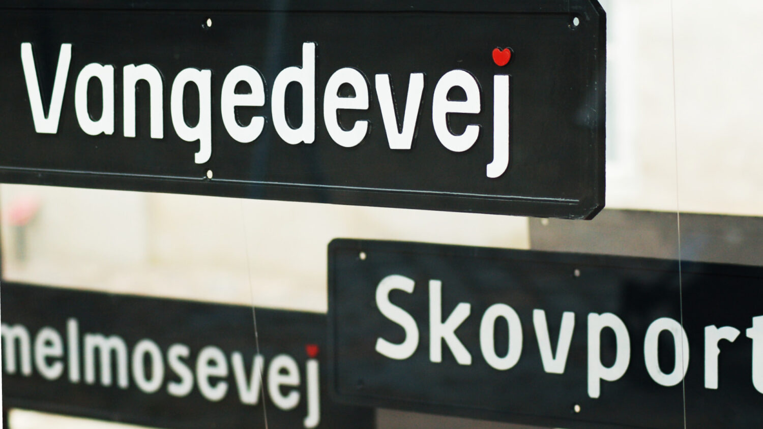
Like the organic shape of the advertising column, Engelhardt’s rational type design also includes soft, rounded ‘human’ shapes in both the interior and exterior contours of the letters. This encounter between rationally operational and welcoming human qualities is a defining characteristic of Engelhardt’s work overall. In the street signs, these signature qualities are combined into a distinctive aesthetic expression that has made the alphabet a source of inspiration for subsequent generations of type designers.
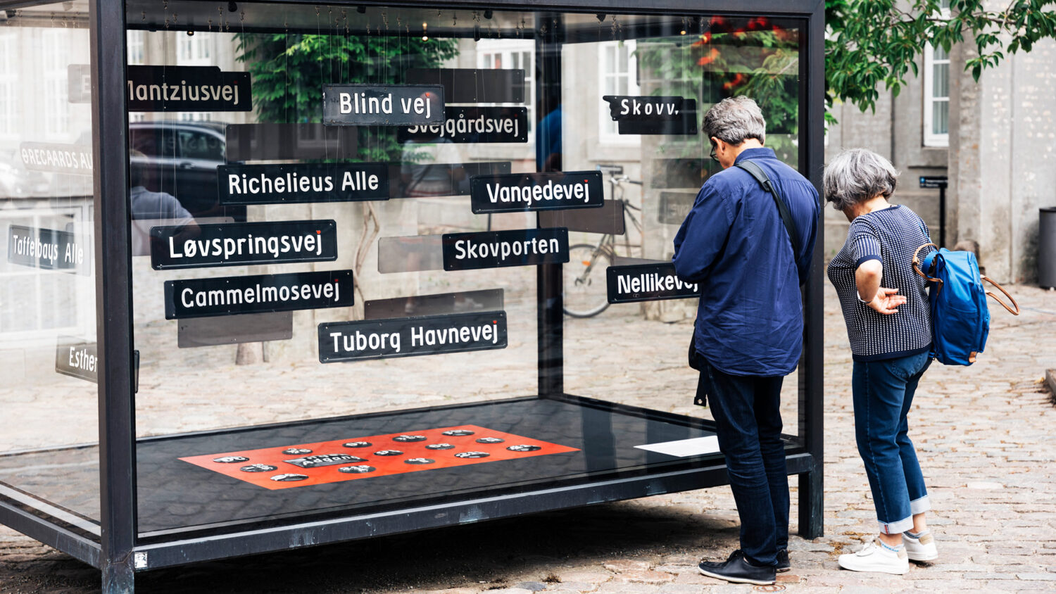
URBAN HEARTBEATS
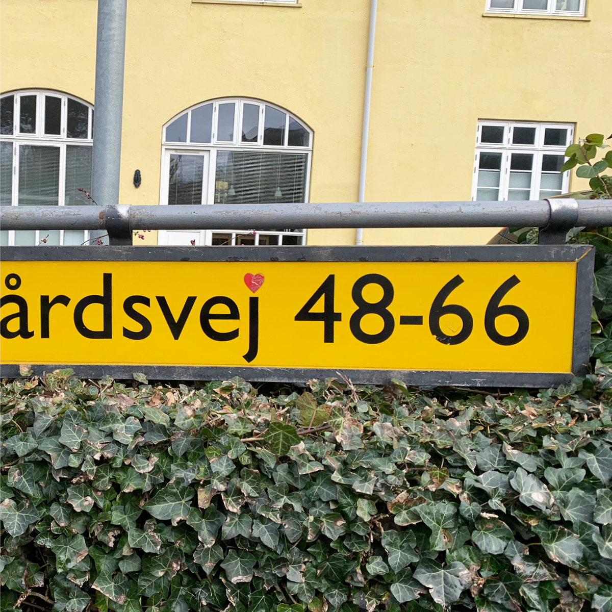
The most iconic feature of Engelhardt’s street signs, which have become an integrated part of Gentofte Municipality’s identity, is his incorporation of the heart in the alphabet. Engelhardt used the heart as his personal signature in most of his sketches and designs as an auditory pun on the second syllable in Engelhardt, heart. On the signs, the heart dots the letter j in all street names ending in ‘vej’ (street) (Frederiksen, 1965). In newer signs, the heart is red, causing it to stand out from the white letters. The origin of the colour is debated. The first signs Engelhardt made had white hearts, but in his sketches and elsewhere, the hearts were often red. Through someone’s intervention, red hearts became the standard on the street signs, and that is the variant that is currently in use in Gentofte Municipality, and it has become a signature feature around town.
Christian Olesen, Gentofte Municipality’s architectural consultant and the initiator of the local anniversary celebrations, describes Engelhardt’s contribution to the municipality as outstanding: ‘It has become a significant part of our local cultural heritage and helps shape the town’s identity’ (Olesen, 2023).
Engelhardt’s advertising columns and sign design have become visual identity markers for Gentofte Municipality and help give the town a unified visual expression. They are part of a wayfinding system that adds character due to its clear aesthetic qualities. Moreover, thanks to the human aspect that characterizes all Engelhardt’s designs, the signs have personality, spark engagement and speak to the individual inhabitants, thus promoting a sense of community and belonging.
The people of Gentofte have embraced the signs and letters as a key aspect of their local identity. Engelhardt’s iconic designs, the advertising column and the award-winning signs, support Gentofte’s branding efforts. Over time, they have helped build an extraordinary sense of local pride, community and identity – so much so that some turn to guerrilla activism when a local street sign does not follow Engelhardt’s original design with the characteristic red heart and traditional typeface. The heartbeat must resonate throughout the town.
Engelhardt’s design illustrates how innovative public design for the urban space can become a municipal brand. It demonstrates the durability of this avant-garde design as well as the municipal administration’s commitment and ability to develop and maintain it over time and thus preventing the brand from becoming irrelevant and obsolete. In 1986, Gentofte Municipality was awarded the ID Classics Prize for introducing Engelhardt’s signage and maintaining it over half a century.
The Danish Design Council’s motivation stated, ‘Behind a good designer there is usually a qualified client. The jury sees the municipality of Gentofte as such as qualified client and user of good design, first by choosing the original design, since by introducing Engelhardt’s street signs and house numbers all over the municipality, and finally by maintaining the solution over a great many years, despite of [sic] shortlived changes in taste and fashion. Today, the Engelhardt signs announce discretely [sic], yet clearly that you are in Gentofte; they have, in fact, become part of what we today call the visual identity of the municipality’ (Danish Design Council, 1986).
The advertising columns, sign type design and the hearts have all endured to this day, 100 years after they were created, and continue to remain relevant and important to both the town and its citizens.
Udstillingen URBAN HEARTBEATS
Designmuseum Denmark’s outdoor exhibition on the museum’s forecourt celebrates the 100th anniversary of the Danish architect, designer and printer Knud V. Engelhardt’s poster column, signage and type design from 1923.
In collaboration with Gentofte Municipality, the exhibition pays tribute to Engelhardt’s iconic public design, which was designed exclusively for Gentofte Municipality.
The poster columns and signs with the red hearts adorn, inform and still show the way through Gentofte’s streets and city life are a canonical example of the importance of public design for visual and cultural local identity.
The anniversary poster was designed by Matthias Horneman-Thielcke and will be hung in the summer of 2023 on the poster columns in Gentofte, around Copenhagen and at the Design Museum Denmark.
The poster is a tribute to Engelhardt’s heart, which beat for public design, typography and font design.
Literature
ARCHITEKTEN, 16. årgang, nr. 15, 1. november 1913
Danish Design Council. (1986). DD Bulletin. Danish Design Council.
Ejlers, S. (1997). Architects in Danish Graphic Design. Scandinavian Journal of Design History, 7, 58–73.
Frederiksen, E. E. (1965). Knud V. Engelhardt: Arkitekt & Bogtrykker 1882—1931.
Millech, K. (1954). DET KONGELIGE AKADEMI FOR SKØNNE KUNSTNER, 1904-1954. GYLDENDAL.
Horneman-Thielcke M. & Beier, S. (under udgivelse). The Genesis of the New Danish Typography, udgives af ECAL University of Art and Design Lausanne, foråret 2024.
The research project The Danish Writing Design Tradition
The exhibition URBAN HEARTBEATS is part of fellow Matthias Horneman-Thielcke’s PhD project on the Danish font design tradition from the first half of the 20th century. The PhD project is a collaboration between Design Museum Denmark and the Royal Academy, Institute for Visual Design, Center for Visibility Design, led by Professor MSO Sofie Beier. It is supported by the New Carlsberg Foundation and was initiated in January 2022. The PhD project aims to document the Danish typographic form over time and the generations of Danish architects and type designers involved in facilitating and promoting it.
Notes
[1] The competition is described in ARCHITEKTEN, 16th year, no. 15, 1 November 1913.
[2] Knud V. Engelhardt’s sketches and paper line can be found in Designmuseum Danmark’s archive.
[3] Sketches and records in Engelhardt’s archive at Designmuseum Denmark indicate that Engelhardt was early inspired by architecture and material choices from the international avant-garde, i.a. from Germany and France. See also the article Horneman-Thielcke, M. & Beier, S. (forthcoming) “THE GENESIS OF THE NEW DANISH TYPOGRAPHY”, ECAL /University of Art and Design Lausanne.
[4] “The Danish Script Design Tradition” includes the Danish modern script design culture from the first half of the 20th century, which emerged from the Academy of Fine Arts’ School of Architecture with key designers such as Thorvald Bindesbøll (1846-1908), Knud V. Engelhardt (1882-1931), Gunnar Biilmann Petersen ( 1897-1968), Claus Achton Friis (1917-1999) and Naur Klint (1920-1978).
[5] Engelhardt’s archive at Designmuseum Danmark paints a picture of Engelhardt as a typographic pioneer in terms of the design of geometric alphabets, the use of grotesque fonts, the design of typographic hierarchies, the use of a limited color palette, the use of “whitespace” and the implementation of graphic asymmetry. Engelhardt worked with all the mentioned features from approx. 1908, long before the Bauhaus and Jan Tschichold’s work “The New Typography”. See Horneman-Thielcke, M. & Beier, S. (forthcoming) “The Genesis of The New Danish Typography”, ECAL /University of Art and Design Lausanne.
[6] Matthias Horneman-Thielcke’s research in Designmuseum Danmark’s KVE archives shows that Engelhardt probably built typographically on letterforms that had previously been primarily designed by engravers or architects for small surfaces, e.g. stamps. By cutting off the diagonal strokes on the letters, a given word could be enlarged, making it easier to read. The cut letterforms appear as early as 1882, in a stamp design by the royal court engraver Phillip Batz. Also in 1902, the forms appear in architect Julius Therchilsen’s (1873-1954) iconic design of the “wave line type” and in 1911 on an Icelandic stamp designed by court engraver Hans Peter Sophus Lindahl (1849-1935).
[7] Conversations with Christian Olesen in May 2023 and Gentofte LIGE NU, 2023, no. 2, 23rd year, p. 5.
Theme: Urban Spaces
On the occasion of Capital of Architecture 2023, Formkraft investigates craftsmanship and design in public spaces and built environments. The themed publication provides column space for the latest research and work with handicrafts and design. Go to theme
More knowledge in the archive
The archive at Formkraft contains a gold mine of articles on crafts and design. Dive into history from 1948-now. For example, search for relevant words in the Archive or read the individual publications by year on the Journal Shelf.
Receive a newsletter
Sign up for Formkraft’s newsletter and receive information about new articles as well as tips on relevant conferences and books. Sign up here.